Just marketing your product is not sufficient. It is very important to earn the trust of your customers. The best to start gaining the trust of people is by explaining who you are and what your company does. One of the most effective ways to achieve your objective is creating an impressive ‘About Us’ page.
What Is About Us Page?
The About Us pages are for sharing the business’ stories and history that can help in making a deep connection with customers. People want to know who is behind the brand and how they came up with the idea. According to the survey, more than 33% of customers prefer to buy only when they trust the business. So, design of the page and the way of representing the whole story behind the brand creation should be displayed well on the ‘About Us’ Page. When it comes to design this page on your website, I would like to recommend you to go for responsive web designing services.
By creating a perfect ‘About Us’ page, you can make an emotional connection with people and create a bond with them on a deeper level. With an About Us page, you can begin to form an emotional relationship with customers and engage with them on a deeper level.
How to create one that resonates with your customers? No matter, which business belongs to which industry, you should create a humble ‘About Us’ page because it plays an important role in sharing brand values and brand stories with the targeted customers.
Inspiring ‘About Us’ Examples
1. Zendesk
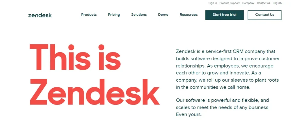
The way Zendesk introduced itself is quite alluring and it is capable to make a high impact. The short and attention-grabbing introduction is capable to connect the business with the customers.
Instead of writing a lengthy paragraph to describe the company’s history, using the right text in the right amount is setting Zendesk apart from its competitors.
After that there’s the mission statement- ‘we’re people people.’ This statement is written in large text over the employee’s picture.
The best thing about the Zendesk’s ‘About Us’ page is that this page constitutes plenty of links that can take you to a charitable foundation, inclusion policy, and more that helps in enhancing the personal connection with the customer. Two more important factors to consider are simple design and a dash of humor.
2. Chime
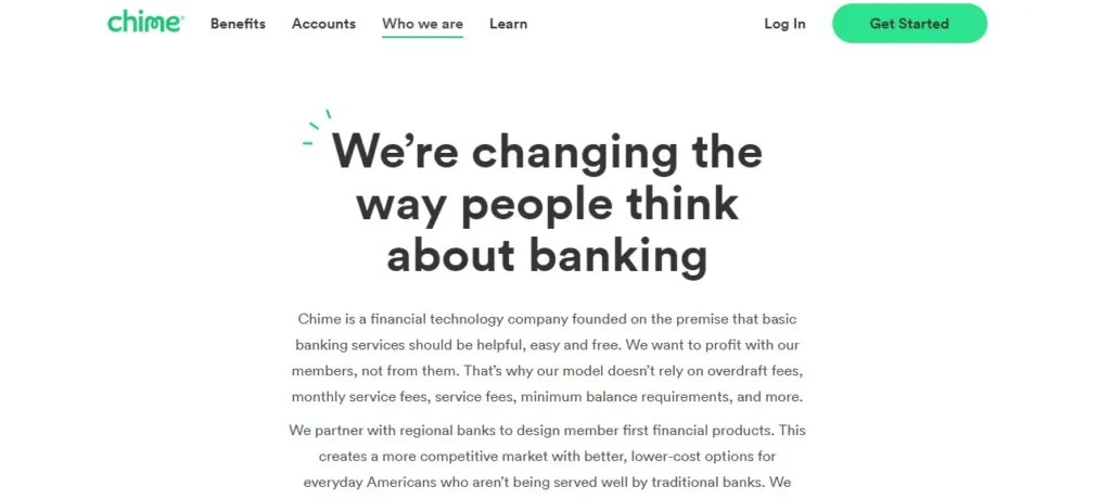
An ‘About Us’ page can help you to make the right impression on your targeted customers. You can change the way they perceive it on the basis of the design you have chosen. Chime is an American Financial technology company. Its about us page makes the impression that it is not an ordinary financial institution.
The best thing about this About Us page is that they have attached the picture of their team members with there on this page. Another intricate detail that you need to know is that the call-to-action is just below the ‘about us’ content. This button lets people easily open up their accounts, and increase the number of account openers in the bank.
3. Wendy’s
The ‘Who We Are’ page will let you know who Wendy’s is and they have narrated their personal story perfectly. With a big brand comes a lot of history, and Wendy’s has plenty of stories to tell to any potential customer.
Wendy’s About Us page is doing a good job by letting the website visitors get to know your business without putting in too much effort. The best thing about Wendy’s About Us page is the bold headline in bold color with a background image of a big juicy burger.

4. Brooklinen
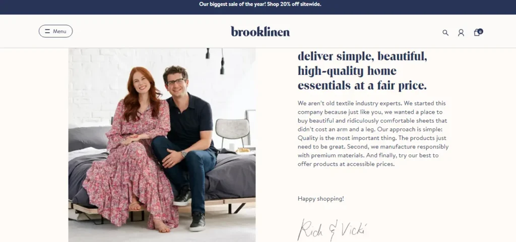
Brooklinen is a homewares store that also has an amazing About Us page. The unique thing about this About Us Page is that it features a picture of its co-founders along with a short introduction. This kind of personal first impression ensures that website visitors will get to know who is the owner of this kind of business. Other important details to consider are high-impact graphics, detailed technical information, and emphasis on the core values of the industry.
5. Liftoff
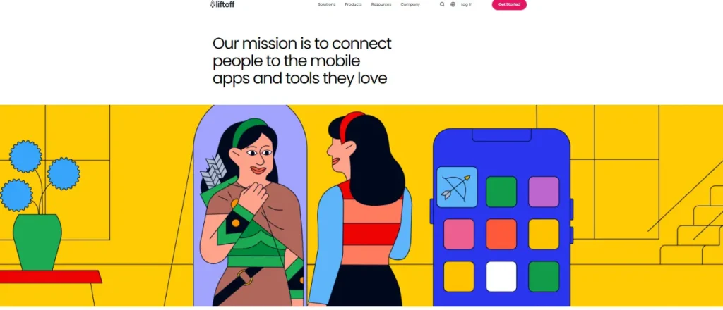
If it is about B2B selling, then stats play an important role. On this ‘About Us’ page, the company’s figures are shown with delicacy and skill that is sure to impress the website visitors. The design of the page is quite simple and it constitutes one big-size logo.
Important features to note down on this ‘About Us’ page are :
- The clearly stated mission at the top of the page is really impressive. An attractive image is displayed on the bright yellow ribbon. It is grabbing the attention of visitors and makes them stop for a while and take a look.
- They have described the history of the company through a small description given under the heading ‘how it started?’
- They have displayed pictures of the main team members. This can gain the trust of people because they love to know who is behind the business. The amazing theme used by the Liftoff company is sure to make a long-lasting impression on the targeted customers.
6. Allbirds
Allbirds is a brand that is not just selling a product, but there is an important message behind its product. The ‘About Us’ page of Allbirds page is doing justice to the main objective of this company.
The video displayed at the top of the ‘About Us’ page with the motto – ‘mother nature made us do it’ is telling what is the main agenda of the company. Other important details to note down are a brief of the brand in just a few paragraphs and displaying the achievement at the end of the page.

7. Transferwise
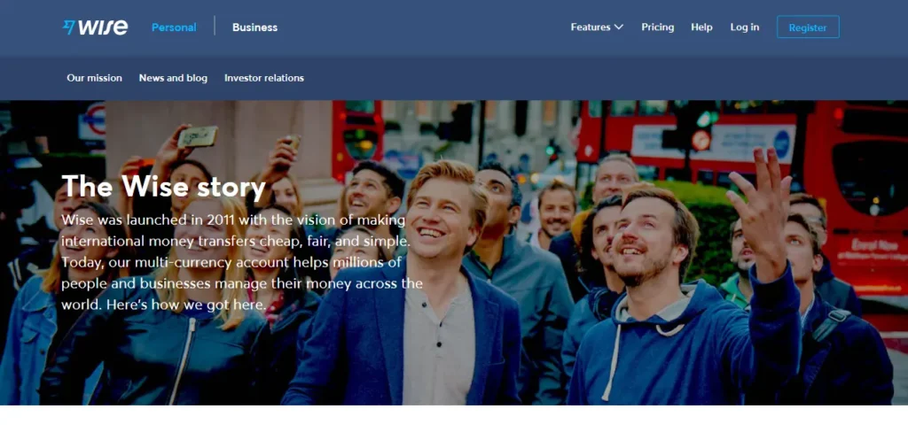
Most successful and impressive ‘About Us’ pages have their team photos. Why not? After all, people should know who is behind the magic. On this page, they have nicely introduced the company.
Things that make this ‘About Us’ page are the perfect placement of CTAs and magical content that make customers buy their services. They have described in detail how to use Transfewise so that people can use it hassle-free.
8. Estrid
This ‘About Us’ page is displaying the marketing message at the top ‘Changing The Razor Game’. This message is accompanied by a big flash photo with a Call-To-Action button
This ‘About Us’ page takes the visitors to the different sections of the store and lets them explore this e-store. The content on this page is quite convincing and gives reasons to the customers why should they use the product of this company.

9. Etsy
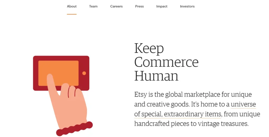
Though this creative marketplace is quite popular that it does not need any kind of introduction, we are going to discuss some important points of its about us page that you may haven’t noticed. All of us are interested in knowing how this mega brand has started its journey. Along with this, we also want to assure that this marketplace is the one that we want to be part of.
The ‘About Us’ page is started with the mission statement of the company in which they have clearly described that they are striving hard to support small businesses. This text is placed right next to the cute animation. Also, they have shared information on how to sell and how to buy on their website. Sell Extraordinarily and Buy Extraordinary sections are paired with CTA buttons. Simple and informative page of Etsy describing all about the company.
